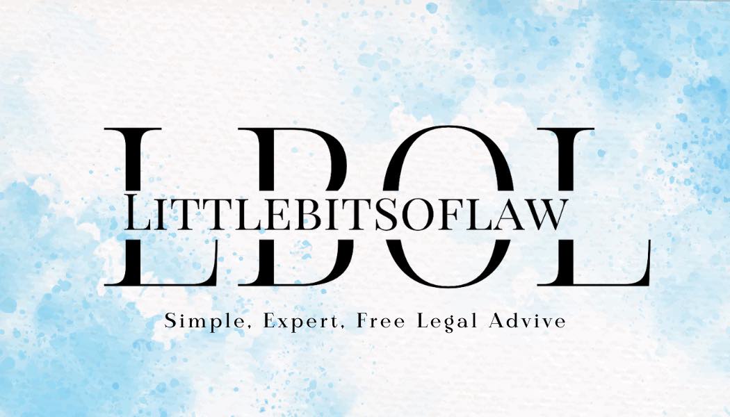
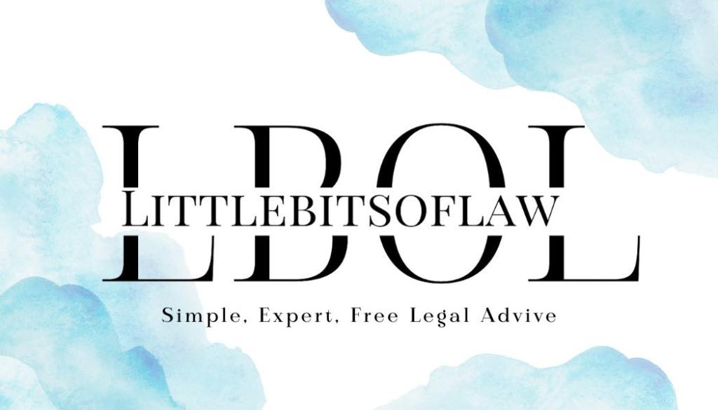
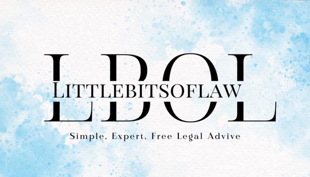
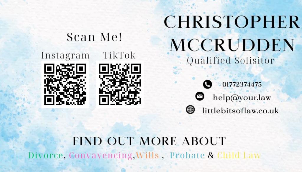
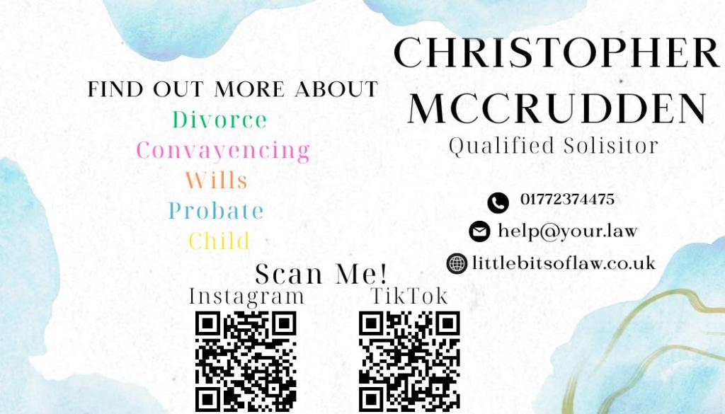
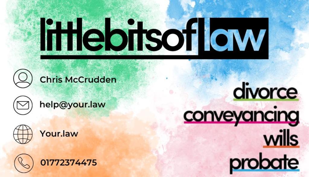
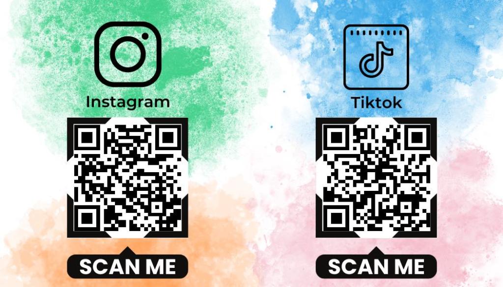
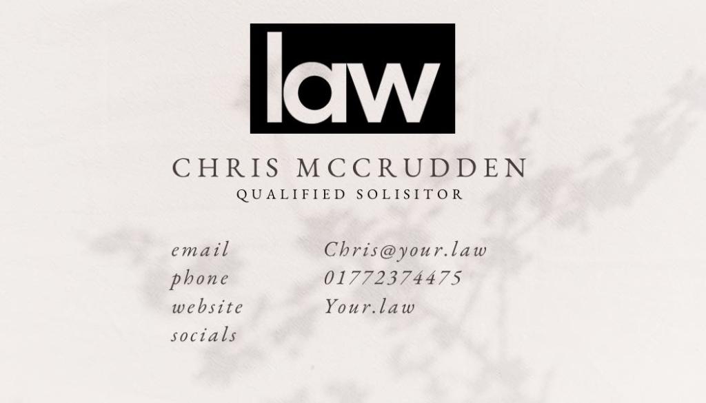
I was tasked with creating a second piece of creative content, which involved designing business cards for littlebitsoflaw and Law. Throughout the process, I collaborated with Annabelle, a fellow student on the Law placement, who provided valuable feedback on my designs. The attached photos showcase four business cards I created – three for littlebitsoflaw and one for Law. While two of the blue designs are similar in colour, their content placement differs.
The first draft of business cards I produced were the ones which feature the original logo and bright colours, the bright colour on and original logo, this was because the client wanted to convey a sense of fun by using colours which relate to the different areas of law, after this draft I then suggested a more professional looking card in which I then produced the two blue cards.
In order to select the best design and colour scheme, I conducted research on the psychological impact that colours have on consumers. Based on the findings, blue was the most favoured colour, while yellow was the least. The research also indicated that warm colours, such as red, can elicit emotions, while cool colours, such as blue, are linked to calmness, relaxation, peacefulness, and positivity (Rathee et al., 2019). Given that littlebitsoflaw deals with legal matters, which can be a stressful process, we decided to use blue in their promotional materials to create a calm and relaxing environment.
At this point, the client has not yet made a decision on whether they will use any of the business card designs that have been created. During my internship, the Law business cards were left unfinished because the client had not yet created QR codes for their social media platforms, which prevented the linking of social platforms.
